









Oranje Bitter Vintage Bitters Poster, 1925
Authentische Kunstwerke
Die von uns gedruckten Kunstwerke werden getreu nach der Originalvorlage restauriert – in der Regel aus einem Museum, einer Bibliothek oder einer privaten Sammlung. Wir ersetzen, zeichnen nicht neu und erfinden das Werk des Künstlers niemals mithilfe generativer KI.
In unserer Londoner Werkstatt aus dem Originalkunstwerk von 1925 restauriert und in Museumsqualität gedruckt. Vollständige Beschreibung
Das Sammlerangebot
Wählen Sie zwei berechtigte Werke und erhalten Sie auf beide 20 % Rabatt. Wählen Sie drei, und das günstigste ist kostenlos – eine maximale Ersparnis von 33 %.
Kombinieren Sie berechtigte Standardkarten und Kunstdrucke nach Belieben. Kein Code erforderlich; das Angebot wird an der Kasse automatisch angewendet.
Standardmäßige Konfigurationen nach Maßanfertigung sind inbegriffen. Maßgeschneiderte Größen, personalisierte Entwürfe und Auftragsarbeiten sind ausgeschlossen.
Benötigen Sie die Lieferung an unterschiedliche Adressen? Kontaktieren Sie uns vor der Bestellung.Das Sammlerangebot
Wählen Sie zwei berechtigte Werke und erhalten Sie auf beide 20 % Rabatt. Wählen Sie drei, und das günstigste ist kostenlos – eine maximale Ersparnis von 33 %.
Kombinieren Sie berechtigte Standardkarten und Kunstdrucke nach Belieben. Kein Code erforderlich; das Angebot wird an der Kasse automatisch angewendet.
Standardmäßige Konfigurationen nach Maßanfertigung sind inbegriffen. Maßgeschneiderte Größen, personalisierte Entwürfe und Auftragsarbeiten sind ausgeschlossen.
Benötigen Sie die Lieferung an unterschiedliche Adressen? Kontaktieren Sie uns vor der Bestellung. In London restauriert • Gedruckt und gerahmt in the UK
Authentische Kunstwerke
Die von uns gedruckten Kunstwerke werden getreu nach der Originalvorlage restauriert – in der Regel aus einem Museum, einer Bibliothek oder einer privaten Sammlung. Wir ersetzen, zeichnen nicht neu und erfinden das Werk des Künstlers niemals mithilfe generativer KI.
Aus dem Originalkunstwerk von 1925 restauriert und in Museumsqualität gedruckt. Vollständige Beschreibung
Größe wählen
Ausführung wählen


(Mehr Infos)
Geschenkmitteilung & individuelle Ausführung

Wenn Sie eine Geschenkmitteilung oder eine Ausführung (Puzzle, Aluminiumplatte usw.) hinzufügen möchten, die hier nicht verfügbar ist, geben Sie dies bitte in der "Bestellnotiz" beim Checkout an.
Jede Bestellung wird individuell angefertigt. Wenn Sie die Größe leicht anpassen oder auf einem ungewöhnlichen Material drucken lassen möchten, lassen Sie es uns einfach wissen. Wir haben im Laufe der Jahre Tausende von individuellen Bestellungen bearbeitet, daher gibt es (fast) nichts, was wir nicht bewältigen können.
Sie können uns auch kontaktieren, bevor Sie bestellen, wenn Sie möchten!
Beliebt bei Sammlern, Designern und Geschenksuchenden
Über 8.000 5-Sterne-Bewertungen

Oranje Bitter, produced in 1925 by the Belgian lithographic firm Oscar de Rycker & Mendel, turns a bottle of bitter into a...
WeiterlesenOranje Bitter, produced in 1925 by the Belgian lithographic firm Oscar de Rycker & Mendel, turns a bottle of bitter into a brisk, highly controlled piece of commercial theatre. The dark brown bottle stands slightly left of centre against an uninterrupted field of warm yellow, while emphatic red lettering sweeps around it. This deliberate imbalance gives the poster its energy: product and typography do not merely occupy separate zones, but curve and counterbalance one another across the page.
The design belongs to the flourishing commercial print culture of the interwar years, when lithography allowed advertisers to combine saturated colour, sharply defined lettering and detailed brand imagery at comparatively modest cost. Oscar de Rycker & Mendel was active in Belgium during the late nineteenth and early twentieth centuries, working within a period in which the poster had become an essential feature of modern urban commerce. Here, a recognisable bottle, a restricted palette and a name readable at speed are brought together to establish an immediate and memorable identity.
A closer look
The yellow ground does much of the compositional work. Its bright, almost total expanse isolates the bottle and gives the darker brown glass unusual visual weight. Only limited modelling is used: slight shadowing suggests the bottle’s rounded form, but the object remains emphatically graphic rather than illusionistic. A thin black border contains the vivid field and lends the entire arrangement the tautness of a label enlarged to poster scale.
Colour is concentrated with particular care around the product itself. Green and red details animate the label, whose fine ornamental lines form a decorative frame within the larger, simplified design. Green leaves beside the bottle establish a small organic counterpoint to the strict geometry of the container. The neck carries further tiny lettering, while the dense label graphics reward closer attention after the dominant silhouette and brand name have registered from afar.
Across the upper portion, “Oranje Bitter” appears in bold red script, its curves echoing the shoulders and sides of the bottle. The smaller black word “NASSAUER” arches above, introducing another tier within the typographic hierarchy. At the base, “FX. de Beukelaar, Anvers-Antwerpen” is set in more restrained serif lettering. The shift from sweeping display script to compact information creates a clear order of attention: brand first, bottle second, maker and place last.
Context and significance
Advertising posters of this period had to function in visually crowded surroundings, communicating before a passer-by had time to examine them closely. Oranje Bitter answers that challenge through reduction rather than abundance. There is no social scene, elaborate setting or narrative anecdote; the bottle itself becomes the protagonist. Spacious yellow ground, strong tonal contrast and carefully staged lettering give the product the clarity of an emblem.
At the same time, the poster preserves the more intricate visual language of packaging within its simplified public message. The decorative label, small inscriptions and botanical accent suggest refinement at close range, while the broad blocks of yellow, brown and red remain effective at a distance. That negotiation between fine detail and immediate impact is what gives the design its enduring interest: it is both a record of Belgian beverage advertising and a concise lesson in how interwar graphic art transformed an everyday commodity into a compelling visual identity.
Choosing the right size and finish
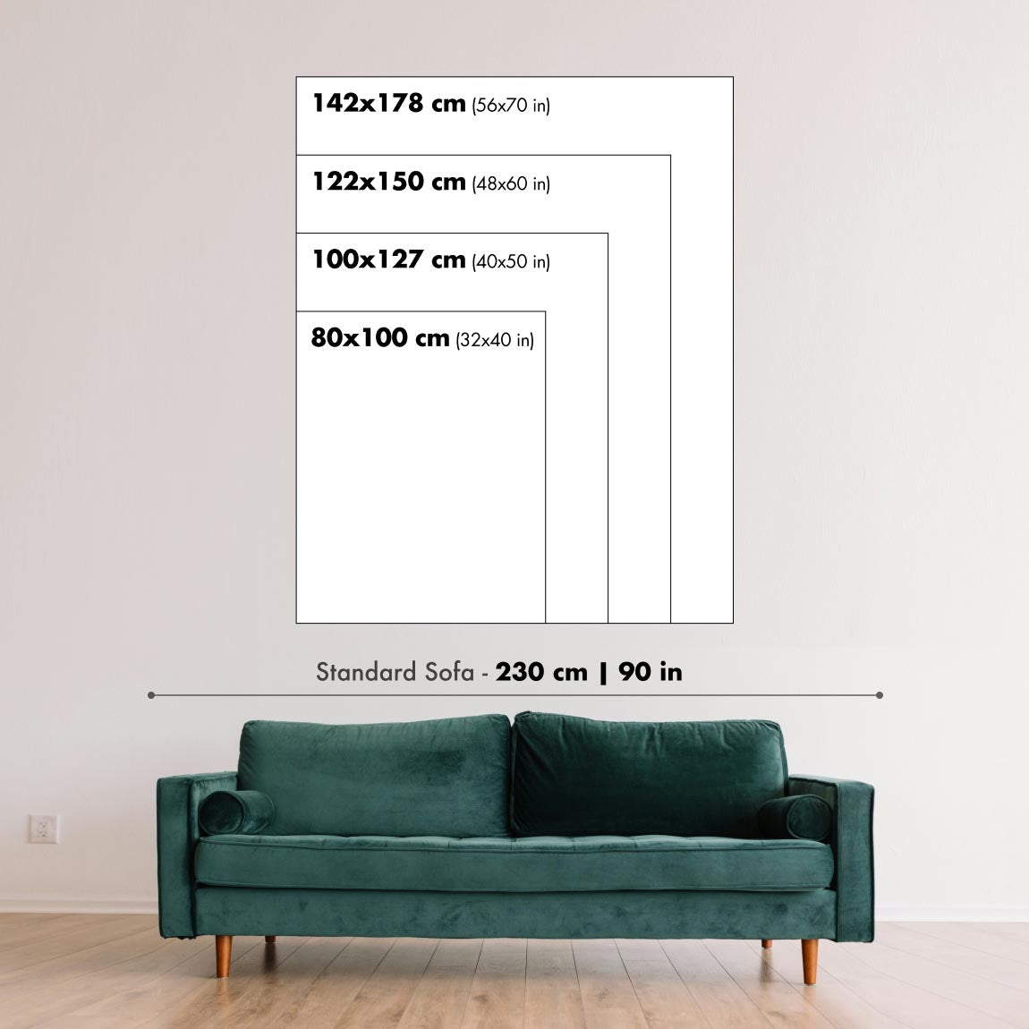
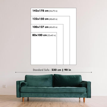
Artwork can feel intimate at smaller sizes and dramatically more architectural at larger ones. Use the room preview, model image and size guide to see how the proportions and scale will work in your space.
If you need an exact size, specialist framing or help planning a larger display, ask our workshop for advice.
The model in the listing images is holding the 18x24in (45x60cm) version of this art print.
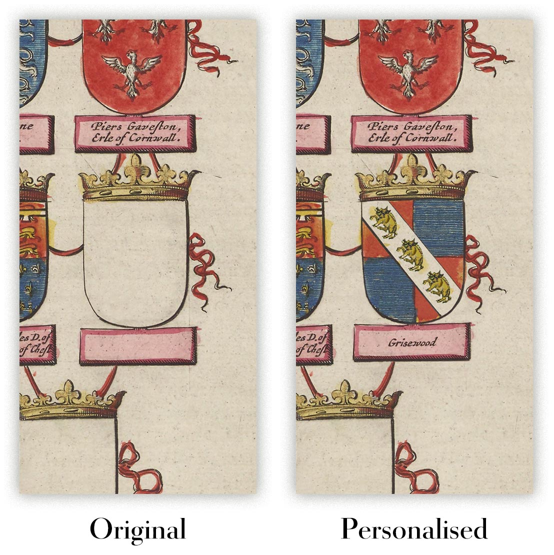
Where personalisation is available, you can add a short title or dedication, or one considered visual detail. See examples of personalised artwork.
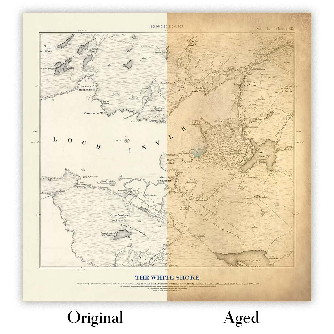
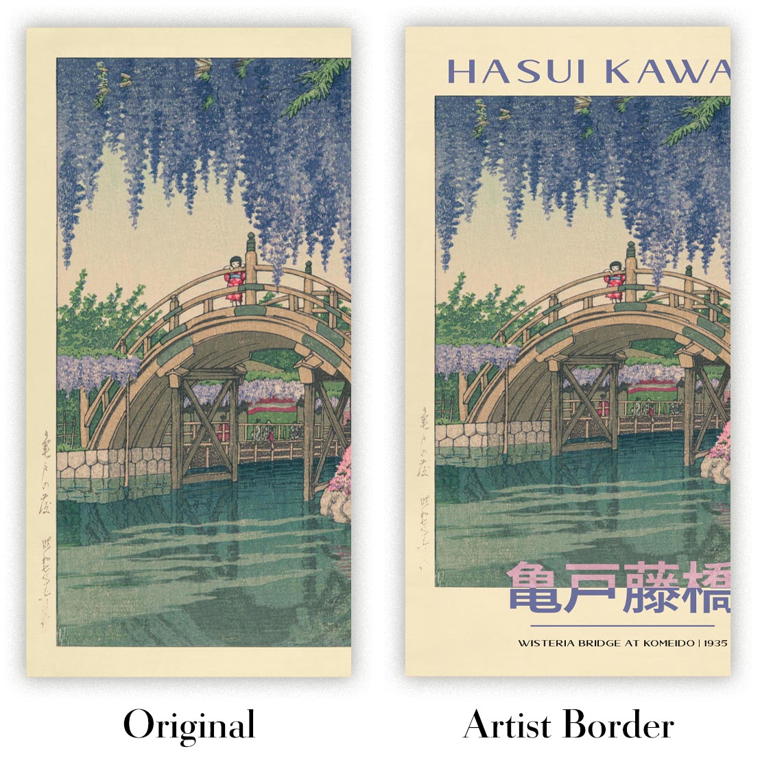
Choose Original to retain the colour and character of the source artwork, or Aged for a warmer, more antique appearance. See examples of our Aged artwork.
Every piece is produced to archival standards using fade-resistant pigment inks on acid-free matte art paper. Choose an art print, framed art print or framed canvas using the finish options above.
Framed art prints use crystal-clear optical acrylic for excellent clarity, lower weight and safer delivery than glass. Each piece arrives professionally framed and ready to hang.
Selected artworks can be produced at statement sizes up to 3 metres (10ft). Custom sizing and specialist framing are also available. If the exact option you need is not listed, contact our workshop.
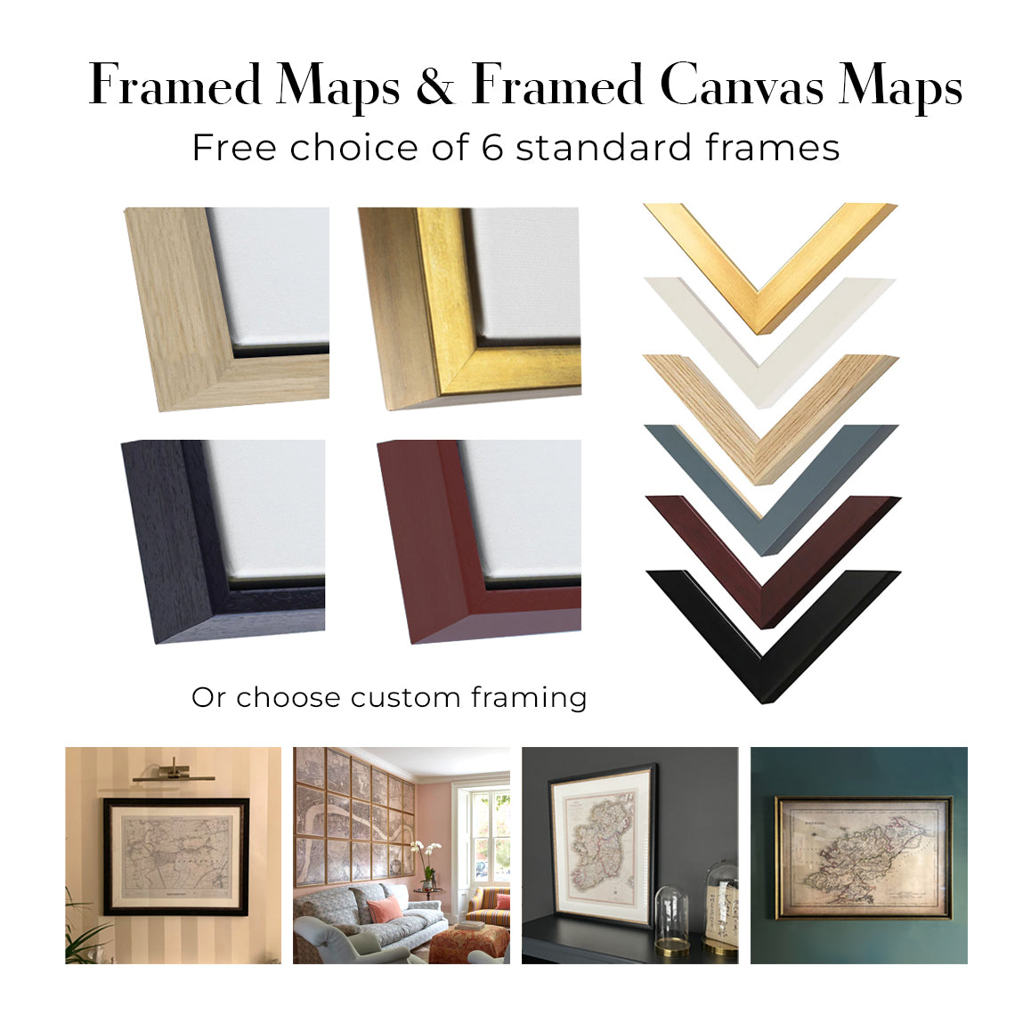
This artwork is also available as a float framed canvas, sometimes known as a shadow gap framed canvas or canvas floater. The work is printed on artist's cotton canvas and then stretched over a handmade box frame. We then "float" the canvas inside a wooden frame, which is available in a range of colours (black, dark brown, oak, antique gold and white). This is a wonderful way to present an art print without glazing in front. See some examples of float framed canvas art and explore the differences between my different finishes.
Oranje Bitter, produced in 1925 by the Belgian lithographic firm Oscar de Rycker & Mendel, turns a bottle of bitter into a brisk, highly controlled piece of commercial theatre. The dark brown bottle stands slightly left of centre against an uninterrupted field of warm yellow, while emphatic red lettering sweeps around it. This deliberate imbalance gives the poster its energy: product and typography do not merely occupy separate zones, but curve and counterbalance one another across the page.
The design belongs to the flourishing commercial print culture of the interwar years, when lithography allowed advertisers to combine saturated colour, sharply defined lettering and detailed brand imagery at comparatively modest cost. Oscar de Rycker & Mendel was active in Belgium during the late nineteenth and early twentieth centuries, working within a period in which the poster had become an essential feature of modern urban commerce. Here, a recognisable bottle, a restricted palette and a name readable at speed are brought together to establish an immediate and memorable identity.
A closer look
The yellow ground does much of the compositional work. Its bright, almost total expanse isolates the bottle and gives the darker brown glass unusual visual weight. Only limited modelling is used: slight shadowing suggests the bottle’s rounded form, but the object remains emphatically graphic rather than illusionistic. A thin black border contains the vivid field and lends the entire arrangement the tautness of a label enlarged to poster scale.
Colour is concentrated with particular care around the product itself. Green and red details animate the label, whose fine ornamental lines form a decorative frame within the larger, simplified design. Green leaves beside the bottle establish a small organic counterpoint to the strict geometry of the container. The neck carries further tiny lettering, while the dense label graphics reward closer attention after the dominant silhouette and brand name have registered from afar.
Across the upper portion, “Oranje Bitter” appears in bold red script, its curves echoing the shoulders and sides of the bottle. The smaller black word “NASSAUER” arches above, introducing another tier within the typographic hierarchy. At the base, “FX. de Beukelaar, Anvers-Antwerpen” is set in more restrained serif lettering. The shift from sweeping display script to compact information creates a clear order of attention: brand first, bottle second, maker and place last.
Context and significance
Advertising posters of this period had to function in visually crowded surroundings, communicating before a passer-by had time to examine them closely. Oranje Bitter answers that challenge through reduction rather than abundance. There is no social scene, elaborate setting or narrative anecdote; the bottle itself becomes the protagonist. Spacious yellow ground, strong tonal contrast and carefully staged lettering give the product the clarity of an emblem.
At the same time, the poster preserves the more intricate visual language of packaging within its simplified public message. The decorative label, small inscriptions and botanical accent suggest refinement at close range, while the broad blocks of yellow, brown and red remain effective at a distance. That negotiation between fine detail and immediate impact is what gives the design its enduring interest: it is both a record of Belgian beverage advertising and a concise lesson in how interwar graphic art transformed an everyday commodity into a compelling visual identity.
Choosing the right size and finish
Artwork can feel intimate at smaller sizes and dramatically more architectural at larger ones. Use the room preview, model image and size guide to see how the proportions and scale will work in your space.
If you need an exact size, specialist framing or help planning a larger display, ask our workshop for advice.
The model in the listing images is holding the 18x24in (45x60cm) version of this art print.
Where personalisation is available, you can add a short title or dedication, or one considered visual detail. See examples of personalised artwork.
Choose Original to retain the colour and character of the source artwork, or Aged for a warmer, more antique appearance. See examples of our Aged artwork.
Every piece is produced to archival standards using fade-resistant pigment inks on acid-free matte art paper. Choose an art print, framed art print or framed canvas using the finish options above.
Framed art prints use crystal-clear optical acrylic for excellent clarity, lower weight and safer delivery than glass. Each piece arrives professionally framed and ready to hang.
Selected artworks can be produced at statement sizes up to 3 metres (10ft). Custom sizing and specialist framing are also available. If the exact option you need is not listed, contact our workshop.
This artwork is also available as a float framed canvas, sometimes known as a shadow gap framed canvas or canvas floater. The work is printed on artist's cotton canvas and then stretched over a handmade box frame. We then "float" the canvas inside a wooden frame, which is available in a range of colours (black, dark brown, oak, antique gold and white). This is a wonderful way to present an art print without glazing in front. See some examples of float framed canvas art and explore the differences between my different finishes.
Viele unserer Karten und Kunstdrucke werden als durchdachte Geschenke für Wohnungen, Büros, Arbeitszimmer und bedeutungsvolle Orte ausgewählt.
Wählen Sie eine gerahmte Option als das einfachste, fertig zum Aufhängen gelieferte Geschenk, oder entscheiden Sie sich für einen ungerahmten Druck, wenn der Empfänger seinen eigenen Rahmen lieber selbst auswählen möchte.
Wir fertigen Bestellungen lokal in 23 Ländern weltweit, sodass Geschenke oft in der Nähe des Empfängers produziert werden können. Das trägt dazu bei, dass sie schneller ankommen, sicherer transportiert werden und Überraschungen durch Zoll oder Einfuhrabgaben vermieden werden.
- Wir können direkt an den Empfänger liefern
- Gerahmte Werke werden fertig zum Aufhängen geliefert
- Ungerahmte Drucke werden sorgfältig in einer stabilen Schutzhülle versandt
- Nahezu jede Bestellung wird lokal gefertigt – für schnelleres und sichereres Schenken
- 90 Tage Rückgaberecht geben dem Empfänger Zeit für seine Entscheidung
Wenn Sie nicht sicher sind, was Sie wählen sollen, kontaktieren Sie uns bitte. Wir helfen Ihnen gern dabei, die passende Karte, Größe, Ausführung oder Lieferoption auszuwählen.
Für die meisten Bestellungen beträgt die Lieferzeit etwa 3 Werktage. Personalisierte und maßgeschneiderte Produkte benötigen länger, da ich die Personalisierung durchführen und sie Ihnen zur Genehmigung zusenden muss, was normalerweise 1 oder 2 Tage dauert.
Bitte beachten Sie, dass sehr große gerahmte Bestellungen in der Regel länger für die Herstellung und Lieferung benötigen.
Wenn Sie möchten, dass Ihre Bestellung bis zu einem bestimmten Datum ankommt, bitte kontaktieren Sie mich, bevor Sie bestellen, damit wir den besten Weg finden können, um sicherzustellen, dass Sie Ihre Bestellung rechtzeitig erhalten.
Ich drucke und rahme Karten und Kunstwerke in 23 Ländern weltweit. Das bedeutet, dass Ihre Bestellung lokal gefertigt wird, was die Lieferzeit verkürzt und sicherstellt, dass sie während der Lieferung nicht beschädigt wird. Sie zahlen nie Zoll oder Einfuhrgebühren, und wir stoßen weniger CO2 in die Luft aus.
Alle meine Karten und Kunstdrucke sind gut verpackt und werden in einem robusten Rohr versendet, wenn sie ungerahmt sind, oder von Schaum umgeben, wenn sie gerahmt sind.
Ich versuche, alle Bestellungen innerhalb von 1 oder 2 Tagen nach Erhalt Ihrer Bestellung zu versenden, obwohl einige Produkte (wie Gesichtsmasken, Tassen und Tragetaschen) länger zur Herstellung benötigen können.
Wenn Sie Express-Lieferung an der Kasse auswählen, priorisieren wir Ihre Bestellung und versenden sie per 1-Tages-Kurier (Fedex, DHL, UPS, Parcelforce).
Nächster Tag Lieferung ist auch in einigen Ländern verfügbar (USA, UK, Singapur, VAE), aber bitte versuchen Sie, früh am Tag zu bestellen, damit wir es rechtzeitig versenden können.
Lesen Sie meinen vollständigen Leitfaden zur Lieferung und lokalen Produktion
Mein Standardrahmen ist ein Galerie-Stil-Rahmen aus schwarzem Eschenholz. Er ist einfach und sieht ziemlich modern aus. Mein Standardrahmen ist etwa 20 mm (0,8 Zoll) breit.
Ich verwende super-klares Acryl (Plexiglas/Acrylt) für das Glas des Rahmens. Es ist leichter und sicherer als Glas – und es sieht besser aus, da die Reflexion geringer ist.
Sechs Standardrahmenfarben sind kostenlos erhältlich (schwarz, dunkelbraun, dunkelgrau, Eiche, weiß und antikgold).
Die meisten Karten, Kunstwerke und Illustrationen sind auch als gerahmte Leinwand erhältlich. Wir verwenden matte (nicht glänzende) Baumwollleinwand, spannen sie über einen nachhaltig beschafften Buchenrahmen und 'schweben' dann das Stück innerhalb eines Holzrahmens. Das Endergebnis ist ziemlich schön, und es gibt keine Verglasung, die im Weg ist.
Alle Rahmen werden "bereit zum Aufhängen" geliefert, entweder mit einer Schnur oder Halterungen auf der Rückseite. Sehr große Rahmen haben schwere Aufhängeplatten und/oder eine Montageschiene. Wenn Sie Fragen haben, können Sie bitte Kontakt aufnehmen.
Sehen Sie sich einige Beispiele meiner gerahmten Karten und gerahmten Leinwandkarten an.
Alternativ kann ich auch alte Karten und Kunstwerke auf Leinwand, Schaumstoffplatten, Baumwollrag und andere Materialien liefern.
Wenn Sie Ihre Karte oder Ihr Kunstwerk selbst rahmen möchten, lesen Sie bitte zuerst meinen Größenleitfaden.
Wir arbeiten mit Innenarchitekten, Unternehmen aus dem Gastgewerbe, Immobilienfachleuten, Büros und Firmenkunden an Einzelstücken sowie an größeren, abgestimmten Projekten.
Dieses Kunstwerk kann an eine bestimmte Wand, einen Raum oder ein Projekt angepasst werden, und unsere Werkstatt unterstützt Sie dabei, Maße, Material und Rahmung vor der Produktion abzustimmen.
- Exakte, übergroße und maßgefertigte Abmessungen
- Individuelle Rahmung, Kaschierung und alternative Materialien
- Abgestimmte Werke für mehrere Räume oder Standorte
- Personalisierung des Kunstwerks zur Anpassung von Farbe und Stil
- Beratung zu Kunstwerk und Rahmung durch unsere Werkstatt
- Lokale Produktion für Projekte weltweit
Besprechen Sie dieses Werk mit unserem Trade & Projects Team
Jeder restaurierte Kunstdruck beginnt mit dem Originalwerk des Künstlers – niemals mit einem KI-generierten Ersatz.
Unser Londoner Studio arbeitet mit sorgfältig ausgewähltem Ausgangsmaterial aus Museen, Bibliotheken, Archiven und privaten Sammlungen. Wir restaurieren altersbedingte Schäden, verblasste Farben und unvollkommene Reproduktionen, während wir die Komposition, den Pinselstrich, die Linienführung, die Textur und den zeittypischen Charakter des Künstlers bewahren.
Wir verwenden keine generative KI, um das Kunstwerk neu zu zeichnen, neu zu interpretieren oder zu erfinden. Digitale Restaurierung dient ausschließlich dazu, das Originalwerk so originalgetreu wie möglich wiederherzustellen und zu reproduzieren.
Sobald die Restaurierung abgeschlossen ist, wird das Masterkunstwerk für die von Ihnen gewählte Größe und Ausführung vorbereitet. Anschließend wird Ihr Stück gedruckt und, sofern ausgewählt, in der Nähe des Lieferorts gerahmt.
Unsere Giclée-Kunstdrucke verwenden säurefreies 200-g/m²-Archiv-Mattpapier und lichtechte Pigmenttinten für ein reichhaltiges Finish in Museumsqualität. Gerahmte Kunstdrucke verwenden kristallklares optisches Acryl und werden hängefertig geliefert.
Gerahmte Leinwand und Sonderausgaben auf Baumwoll-Künstlerpapier sind ebenfalls erhältlich. Erfahren Sie mehr über unsere Materialien und Ausführungen.
Seit 1984 restaurieren und fertigen wir Karten und Kunstdrucke an, und wir stehen hinter jedem einzelnen Stück.
Jede Bestellung ist durch unsere 10-Jahres-Garantie und unsere Garantie für beschädigungsfreie Lieferung abgesichert. Sollte Ihr Stück beschädigt bei Ihnen ankommen, ersetzen oder reproduzieren wir es kostenlos. Sollte sonst etwas nicht in Ordnung sein, kontaktieren Sie unser Werkstatt-Team, und wir kümmern uns umgehend darum.
Ausführliche Informationen finden Sie in unseren Rückgabe- und Erstattungsrichtlinien.


