










Kina Perrier Vintage Aperitif Poster, 1895
Opera d’arte autentica
L’opera d’arte che stampiamo è fedelmente restaurata dalla fonte originale - solitamente un museo, una biblioteca o una collezione privata. Non sostituiamo mai, ridisegniamo o inventiamo l’opera dell’artista usando l’IA generativa.
Restaurata nel nostro laboratorio di Londra dall’opera originale del 1895 e stampata in qualità museale. Descrizione completa
L’offerta del Collezionista
Scegli due opere idonee e ricevi il 20% di sconto su entrambe. Scegline tre e quella al prezzo più basso è in omaggio, con un risparmio massimo del 33%.
Abbina liberamente mappe standard idonee e stampe d’arte fine art. Non è richiesto alcun codice; l’offerta viene applicata automaticamente al checkout.
Sono incluse le configurazioni standard su ordinazione. Sono esclusi formati su misura, design personalizzati e lavori su commissione.
Hai bisogno di consegne a indirizzi diversi? Contattaci prima di effettuare l’ordine.L’offerta del Collezionista
Scegli due opere idonee e ricevi il 20% di sconto su entrambe. Scegline tre e quella al prezzo più basso è in omaggio, con un risparmio massimo del 33%.
Abbina liberamente mappe standard idonee e stampe d’arte fine art. Non è richiesto alcun codice; l’offerta viene applicata automaticamente al checkout.
Sono incluse le configurazioni standard su ordinazione. Sono esclusi formati su misura, design personalizzati e lavori su commissione.
Hai bisogno di consegne a indirizzi diversi? Contattaci prima di effettuare l’ordine. Restaurato a Londra • Stampato e incorniciato in the UK
Opera d’arte autentica
L’opera d’arte che stampiamo è fedelmente restaurata dalla fonte originale - solitamente un museo, una biblioteca o una collezione privata. Non sostituiamo mai, ridisegniamo o inventiamo l’opera dell’artista usando l’IA generativa.
Restaurata dall’opera originale del 1895 e stampata in qualità museale. Descrizione completa
Scegli il formato
Scegli la finitura


(Maggiori informazioni)
Gift message & custom finish

If you want to add a gift message, or a finish (jigsaw, aluminium board, etc.) that is not available here, please request it in the "order note" when you check out.
Every order is custom made, so if you need the size adjusted slightly, or printed on an unusual material, just let us know. We've done thousands of custom orders over the years, so there's (almost) nothing we can't manage.
You can also contact us before you order, if you prefer!
La scelta di collezionisti, designer e di chi cerca un regalo speciale
Oltre 8.000 recensioni a 5 stelle

Kina Perrier Aperitif, produced by Imp. B. Sirven in 1895, turns a beverage advertisement into a miniature theatrical spectacle. Beneath the emphatic...
Continua a leggereKina Perrier Aperitif, produced by Imp. B. Sirven in 1895, turns a beverage advertisement into a miniature theatrical spectacle. Beneath the emphatic words “APÉRITIF KINA PERRIER”, a woman in brilliant red and yellow balances upon an improbably large guitar, one hand opening a fan as her patterned shawl flares around her. A seated man raises his glass nearby, while a bull, barrel and prominently displayed bottle complete an exuberant composition associated with Nîmes. Strong outlines, broad areas of colour and the deliberate exaggeration of scale allow its message to register almost instantly.
The poster belongs to the flourishing illustrated advertising culture of fin-de-siècle France, when streets, cafés and shop windows became vivid arenas for commercial graphic art. Imp. B. Sirven, a printing house active during the nineteenth and early twentieth centuries, was known for colourful poster work of this kind. Here the product is not presented through sober information but through spectacle: music, costume, gesture and conviviality construct an atmosphere around the aperitif. The word “kina” was widely used for bitter aperitif drinks associated with cinchona, making the name itself part of a recognisable late nineteenth-century beverage culture.
A closer look
The design’s central conceit is the guitar, enlarged until it becomes both musical instrument and stage. Its long diagonal body helps connect the standing woman with the lower half of the poster, while tiny shadows beneath her feet give the fanciful arrangement a surprising sense of contact. Her fan is described with fine radiating lines, and the floral detail of her shawl introduces a more intricate decorative register within the surrounding blocks of scarlet, golden yellow and warm cream.
At the lower right, the seated man’s green clothing provides a cool counterweight to the woman’s fiery palette. Beading and embroidery enliven his jacket, but his most legible gesture is the raised glass: a compact visual cue of sociability and approval. The bottle beside the table ensures that the advertised drink remains visible amid the performance. On the opposite side, a barrel marked “KINA PERRIER NIMES” anchors the scene with both brand and place; grapes and vine leaves reinforce the beverage theme without interrupting the main action.
The bull at the upper left adds another emphatic silhouette to an already crowded ensemble. Rather than creating deep pictorial space, the printer layers figures and objects across a relatively flat field, allowing each element to function almost like a sign. Thin red and yellow borders contain this abundance, while decorative foliage softens the edges. The result is asymmetric but carefully balanced: the woman dominates the centre, the dark bull and labelled barrel weight the left, and the green-clad drinker stabilises the right.
Context and significance
Commercial posters of the 1890s had to compete for attention in busy public settings, and Kina Perrier Aperitif demonstrates the resulting economy of visual communication. The brand name occupies the highest and most immediately readable position; beneath it, saturated colour and oversized forms create recognition at a distance. Only on closer inspection do the smaller pleasures emerge—the bottle label, the fan’s structure, the embroidered costume and the curling vine motifs.
Its appeal lies in this combination of direct advertising and decorative excess. The poster does not document an everyday drinking scene so much as assemble a spirited fantasy around the product, using music, performance and a communal toast to make Kina Perrier memorable. It is a lively example of how late nineteenth-century French graphic design could transform a simple commercial proposition into an image with its own rhythm, humour and visual drama.
Choosing the right size and finish
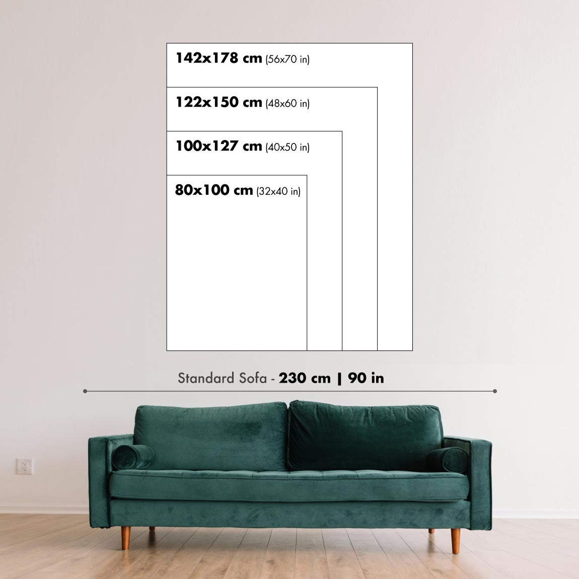
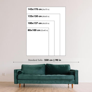
Artwork can feel intimate at smaller sizes and dramatically more architectural at larger ones. Use the room preview, model image and size guide to see how the proportions and scale will work in your space.
If you need an exact size, specialist framing or help planning a larger display, ask our workshop for advice.
The model in the listing images is holding the 18x24in (45x60cm) version of this art print.
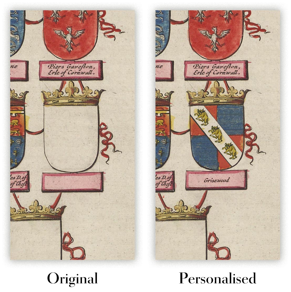
Where personalisation is available, you can add a short title or dedication, or one considered visual detail. See examples of personalised artwork.
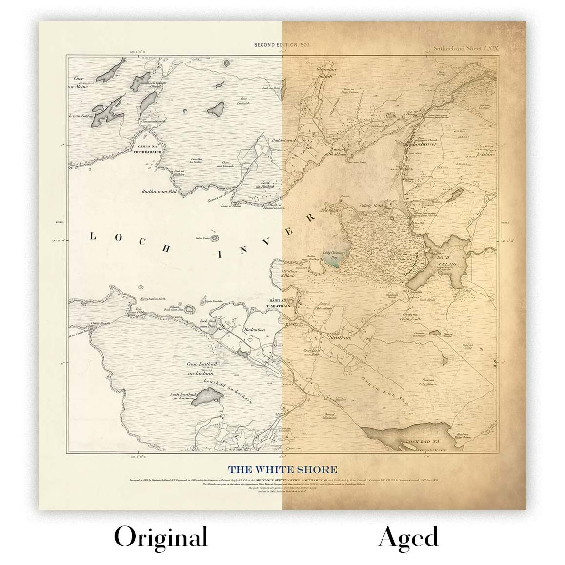
Choose Original to retain the colour and character of the source artwork, or Aged for a warmer, more antique appearance. See examples of our Aged artwork.
Every piece is produced to archival standards using fade-resistant pigment inks on acid-free matte art paper. Choose an art print, framed art print or framed canvas using the finish options above.
Framed art prints use crystal-clear optical acrylic for excellent clarity, lower weight and safer delivery than glass. Each piece arrives professionally framed and ready to hang.
Selected artworks can be produced at statement sizes up to 3 metres (10ft). Custom sizing and specialist framing are also available. If the exact option you need is not listed, contact our workshop.
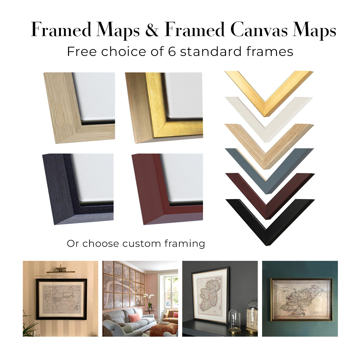
This artwork is also available as a float framed canvas, sometimes known as a shadow gap framed canvas or canvas floater. The work is printed on artist's cotton canvas and then stretched over a handmade box frame. We then "float" the canvas inside a wooden frame, which is available in a range of colours (black, dark brown, oak, antique gold and white). This is a wonderful way to present an art print without glazing in front. See some examples of float framed canvas art and explore the differences between my different finishes.
Kina Perrier Aperitif, produced by Imp. B. Sirven in 1895, turns a beverage advertisement into a miniature theatrical spectacle. Beneath the emphatic words “APÉRITIF KINA PERRIER”, a woman in brilliant red and yellow balances upon an improbably large guitar, one hand opening a fan as her patterned shawl flares around her. A seated man raises his glass nearby, while a bull, barrel and prominently displayed bottle complete an exuberant composition associated with Nîmes. Strong outlines, broad areas of colour and the deliberate exaggeration of scale allow its message to register almost instantly.
The poster belongs to the flourishing illustrated advertising culture of fin-de-siècle France, when streets, cafés and shop windows became vivid arenas for commercial graphic art. Imp. B. Sirven, a printing house active during the nineteenth and early twentieth centuries, was known for colourful poster work of this kind. Here the product is not presented through sober information but through spectacle: music, costume, gesture and conviviality construct an atmosphere around the aperitif. The word “kina” was widely used for bitter aperitif drinks associated with cinchona, making the name itself part of a recognisable late nineteenth-century beverage culture.
A closer look
The design’s central conceit is the guitar, enlarged until it becomes both musical instrument and stage. Its long diagonal body helps connect the standing woman with the lower half of the poster, while tiny shadows beneath her feet give the fanciful arrangement a surprising sense of contact. Her fan is described with fine radiating lines, and the floral detail of her shawl introduces a more intricate decorative register within the surrounding blocks of scarlet, golden yellow and warm cream.
At the lower right, the seated man’s green clothing provides a cool counterweight to the woman’s fiery palette. Beading and embroidery enliven his jacket, but his most legible gesture is the raised glass: a compact visual cue of sociability and approval. The bottle beside the table ensures that the advertised drink remains visible amid the performance. On the opposite side, a barrel marked “KINA PERRIER NIMES” anchors the scene with both brand and place; grapes and vine leaves reinforce the beverage theme without interrupting the main action.
The bull at the upper left adds another emphatic silhouette to an already crowded ensemble. Rather than creating deep pictorial space, the printer layers figures and objects across a relatively flat field, allowing each element to function almost like a sign. Thin red and yellow borders contain this abundance, while decorative foliage softens the edges. The result is asymmetric but carefully balanced: the woman dominates the centre, the dark bull and labelled barrel weight the left, and the green-clad drinker stabilises the right.
Context and significance
Commercial posters of the 1890s had to compete for attention in busy public settings, and Kina Perrier Aperitif demonstrates the resulting economy of visual communication. The brand name occupies the highest and most immediately readable position; beneath it, saturated colour and oversized forms create recognition at a distance. Only on closer inspection do the smaller pleasures emerge—the bottle label, the fan’s structure, the embroidered costume and the curling vine motifs.
Its appeal lies in this combination of direct advertising and decorative excess. The poster does not document an everyday drinking scene so much as assemble a spirited fantasy around the product, using music, performance and a communal toast to make Kina Perrier memorable. It is a lively example of how late nineteenth-century French graphic design could transform a simple commercial proposition into an image with its own rhythm, humour and visual drama.
Choosing the right size and finish
Artwork can feel intimate at smaller sizes and dramatically more architectural at larger ones. Use the room preview, model image and size guide to see how the proportions and scale will work in your space.
If you need an exact size, specialist framing or help planning a larger display, ask our workshop for advice.
The model in the listing images is holding the 18x24in (45x60cm) version of this art print.
Where personalisation is available, you can add a short title or dedication, or one considered visual detail. See examples of personalised artwork.
Choose Original to retain the colour and character of the source artwork, or Aged for a warmer, more antique appearance. See examples of our Aged artwork.
Every piece is produced to archival standards using fade-resistant pigment inks on acid-free matte art paper. Choose an art print, framed art print or framed canvas using the finish options above.
Framed art prints use crystal-clear optical acrylic for excellent clarity, lower weight and safer delivery than glass. Each piece arrives professionally framed and ready to hang.
Selected artworks can be produced at statement sizes up to 3 metres (10ft). Custom sizing and specialist framing are also available. If the exact option you need is not listed, contact our workshop.
This artwork is also available as a float framed canvas, sometimes known as a shadow gap framed canvas or canvas floater. The work is printed on artist's cotton canvas and then stretched over a handmade box frame. We then "float" the canvas inside a wooden frame, which is available in a range of colours (black, dark brown, oak, antique gold and white). This is a wonderful way to present an art print without glazing in front. See some examples of float framed canvas art and explore the differences between my different finishes.
Molte delle nostre mappe e stampe d’arte vengono scelte come regali premurosi per case, uffici, studi e luoghi significativi.
Scegli un’opzione incorniciata per il regalo più semplice, pronto da appendere, oppure scegli una stampa non incorniciata se il destinatario preferisce selezionare la propria cornice.
Realizziamo gli ordini localmente in 23 paesi in tutto il mondo, così i regali possono spesso essere prodotti vicino al destinatario. Questo li aiuta ad arrivare più rapidamente, a viaggiare in maggiore sicurezza e a evitare sorprese legate a dazi doganali o di importazione.
- Possiamo consegnare direttamente al destinatario
- I pezzi incorniciati arrivano pronti da appendere
- Le stampe non incorniciate sono accuratamente imballate in un robusto tubo protettivo
- Quasi ogni ordine viene realizzato localmente, per regali più rapidi e sicuri
- Il reso entro 90 giorni dà al destinatario il tempo di decidere
Se non sei sicuro di cosa scegliere, ti invitiamo a contattarci. Possiamo aiutarti a scegliere la mappa, il formato, la finitura o l’opzione di consegna più adatti.
Most orders are made locally and delivered in around 2–3 working days, depending on the product, size and destination.
We print and frame maps and artwork in 24 countries around the world, so your order is usually made close to you or your recipient. That means faster delivery, less time in transit, and no customs or import duty surprises.
Personalised and customised pieces usually take an extra 1–2 working days, because we prepare your design and send it to you for approval before printing.
Very large framed orders can take a little longer, as they need extra care in production and delivery.
Every order is carefully packaged: unframed prints are sent in a strong protective tube, while framed pieces are securely packed with protective materials around the frame.
If you need your order by a particular date, please contact us before ordering. We’ll check the best production route and delivery option for your location.
Express delivery is available at checkout for most countries. Next-day delivery is available in the UK, US, Singapore and the UAE.
Your order is covered by our 90-day returns policy and 10-year guarantee.
Our standard frame is a gallery-style black ash hardwood frame, with a simple, modern look. It is approximately 20mm (0.8in) wide. You can also view some lovely customer photos of framed maps and art.
We use super-clear acrylic glazing, also known as Perspex or Acrylite, instead of traditional glass. It is lighter, safer, and has lower reflectivity, giving the artwork a clearer, cleaner appearance.
Six standard frame colours are available at no extra cost: black, dark brown, dark grey, oak, white, and antique gold. Custom framing and mounting/matting is also available for customers looking for something more specific.
Most maps, art prints, and illustrations are also available as a framed canvas. We use matte cotton canvas, stretch it over a sustainably sourced wooden box frame, and then float the piece within a wooden outer frame. The finished result is beautifully presented, with no glazing between you and the artwork.
All frames are supplied ready to hang, with either string or brackets fitted to the back. Very large frames will include heavy-duty hanging plates and/or a mounting baton. If you have any questions, please get in touch.
We can also supply old maps and artwork on canvas, foam board, cotton rag, and other materials.
If you would prefer to frame your map or artwork yourself, please read our size guide before ordering.
Lavoriamo con interior designer, realtà del settore hospitality, professionisti del settore immobiliare, uffici e acquirenti aziendali per singoli pezzi e progetti coordinati di più ampia portata.
Quest'opera può essere adattata a una specifica parete, stanza o progetto e il nostro laboratorio può aiutare a coordinare dimensioni, materiale e incorniciatura prima della produzione.
- Dimensioni precise, extra-large e su misura
- Incorniciatura personalizzata, montaggio e materiali alternativi
- Pezzi coordinati per più stanze o sedi
- Personalizzazione dell'opera, per regolarne il colore e lo stile
- Consulenza su arte e incorniciatura da parte del nostro laboratorio
- Produzione locale per progetti in tutto il mondo
Ogni stampa artistica restaurata inizia dall’opera originale dell’artista—mai da una sostituzione generata dall’IA.
Il nostro studio di Londra lavora a partire da materiali di origine accuratamente selezionati da musei, biblioteche, archivi e collezioni private. Restauriamo i danni dovuti all’età, i colori sbiaditi e le imperfezioni di riproduzione, preservando al contempo la composizione, il tratto del pennello, il segno, la texture e il carattere d’epoca dell’artista.
Non utilizziamo l’IA generativa per ridisegnare, reinterpretare o inventare l’opera. Il restauro digitale viene impiegato solo per recuperare e riprodurre l’opera originale nel modo più fedele possibile.
Una volta restaurata, l’opera master viene preparata per il formato e la finitura da te scelti. Il tuo pezzo viene quindi stampato e, se selezionato, incorniciato vicino alla destinazione di consegna.
Le nostre stampe artistiche giclée utilizzano carta opaca archivistica senza acidi da 200 g/m² e inchiostri pigmentati resistenti allo sbiadimento, per una finitura ricca e di qualità museale. Le stampe artistiche incorniciate utilizzano acrilico ottico cristallino e arrivano pronte da appendere.
Sono disponibili anche tele incorniciate ed edizioni speciali su cotone-rag. Scopri di più sui nostri materiali e finiture.
Restauriamo e produciamo mappe e stampe d’arte dal 1984, e garantiamo personalmente ogni pezzo.
Ogni ordine è coperto dalla nostra garanzia di 10 anni e dalla garanzia di consegna senza danni. Se il vostro pezzo arriva danneggiato, lo sostituiremo o lo rifaremo gratuitamente. Se qualsiasi altro aspetto non fosse conforme, contattate il nostro team di laboratorio e provvederemo tempestivamente a risolvere il problema.
Per tutti i dettagli, consultate la nostra politica su resi e rimborsi.


